Component-Driven Development
Build UIs in a better way: from the component up

The biggest trend in frontend user interface (UI) development for the web in recent years has been towards components. The React library, although by no means the first, has in large part established patterns for building UIs out of well specified component parts.

Of course, the trend toward software built from smaller pieces that perform a well-specified role is nothing new; modularization has been one of the key tenets of software engineering since long before I learned the concepts of “coupling and cohesion”.
What is Component-Driven Development?
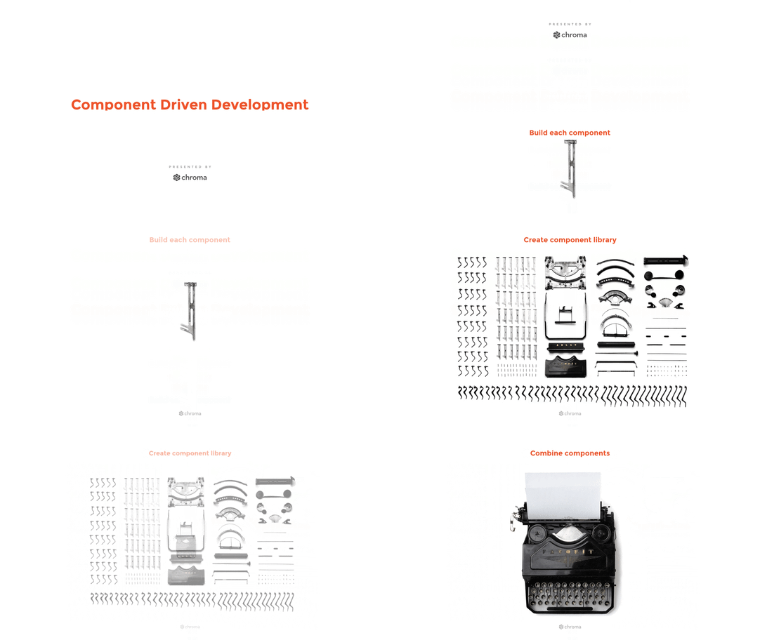
Component-Driven Development (CDD) is a development methodology that anchors the build process around components. It is a process that builds UIs from the “bottom up” by starting at the level of components and ending at the level of pages or screens.
Over the last several years, we at Chroma along with peers at companies like IBM, Hubspot and AirBnB have found this approach to greatly accelerate the development process, improve the nature of developer-designer communication and allow us to consistently attain a higher level of product quality.

Benefits
So what is the big deal about working one component at a time in a fixed series of states? Let me count the ways:
- Focus development: Working on a single component by manipulating an entire app into a certain state is painful and laborious. Certain states can be difficult or impossible to achieve within the full app context in development (think certain loading or error states).
- Increase UI coverage: Enumerating all relevant states means you can be confident you’ve not missed anything and the component works in all possible scenarios.
- Target feedback: Looking it up in an explorer is a much easier way for a colleague to review a new or changed component; Focusing on one component at a time allows communication (especially between design and development) to happen with much higher precision.
- Build a component library: Supercharge component reuse within your app and organization.
- Parallelize development: Working one component at a time allows you to share tasks between different team members in a way that is just not possible at the level of “screens”.
- Test visually: Component explorers allow for a class of “visual” tests, analogous to traditional automated tests, in an area (UIs) that has often defied automated testing. In particular, they allow a form of “Visual TDD” that has the same benefits as TDD, but in the UI arena.
Expect to see more detail on each of these points in upcoming posts.
Tools: component explorers
Tools are emerging to support CDD, and chief amongst them is the Component Explorer.
A component explorer is a separate application which showcases the components in your app in various test “states”. A state is essentially a visual test case — an typical input to the component.
Using the explorer you can test a given component in all the states that have been defined to be important. This isolation is key in enabling a workflow where you build one component at a time.
Adding a component to an explorer is typically as simple as programmatically enumerating the interesting states (in React this is the props and context of that component). This may be familiar to you — enumerating states is exactly how you do snapshot testing or screenshot testing (and it’s no surprise to see features that combine the above with component explorers).
Once you have detailed the interesting states of a component, you can exhaustively visually test the component with just a few clicks. Learn more about component explorers below.

Getting Started
A great thing about CDD is that you don’t need buy-in from your whole team to give it a try. Although it is awesome when everyone from design onwards thinks and works in terms of components (and it is a trend in design also), most of the benefits above accrue even for a single developer.
Try it out
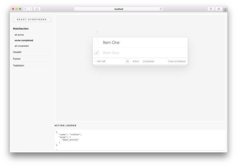
There are component explorers for many different environments, but if you are using React, I suggest you try React Storybook. As an example of what it brings to the table, check out this TodoMVC example preloaded with a component explorer:

Use it in your app
Once you are keen to try it in your own project, getting started couldn’t be easier. Simply run the following steps:
- Install Storybook as a development dependency:
npm i -g getstorybook; cd app; getstorybook. - Add a test state (a “story”) to the component you are working on, by adding a story file (say
src/components/stories/Component.js):
import React from 'react';
import { storiesOf } from '@kadira/storybook';
import Component from '../Component';

storiesOf('Component')
  .add('first spec', () => <Component with="some" props={you('would like to test')} />)
BasicStorybook.js
3. Run npm run storybook and browse to the storybook app (the component explorer) running locally.
That’s it. Now you can start adding more stories to your Component and testing them visually in the Storybook UI. Later, when you need to change Component you can return to the explorer and test the stories you’ve created to ensure that you thoroughly test the changes in all scenarios.
As you build your app out of composed components, you’ll find that the states for each components anchor your thinking in real inputs and your confidence in all the states of your app has increased.
Conclusion
Component-Driven Development describes a development methodology that is being embraced by more and more companies to build higher-quality, more complex user interfaces.
To get the full benefits of UI components, you need processes and tools to help you. The CDD process paired with component explorers offer a straightforward path toward that goal.
More CDD?
If this post has piqued your interest, or you are already a true believer in CDD, we are planning a series of posts on the topic, digging into the benefits outlined above in more detail. Sign up to our mailing list to discover more.