How design systems use Storybook
A roundup of the best Storybook techniques from leading design systems
Design systems are essential infrastructure for tech companies like Shopify, Workday, and Salesforce. The benefits of design systems are championed by frontend luminaries like Brad Frost, Taurie Davis, and Nathan Curtis.
Frontend teams everywhere can ship faster with less work by adopting design systems for code reuse. Storybook’s open source tooling enables everyone, from solo developers to massive teams, to launch their own design systems with less work.
This article shares how real design systems use Storybook. You’ll get a glimpse of the addons and battle-tested workflows that can inspire your own design system.

What is a design system?
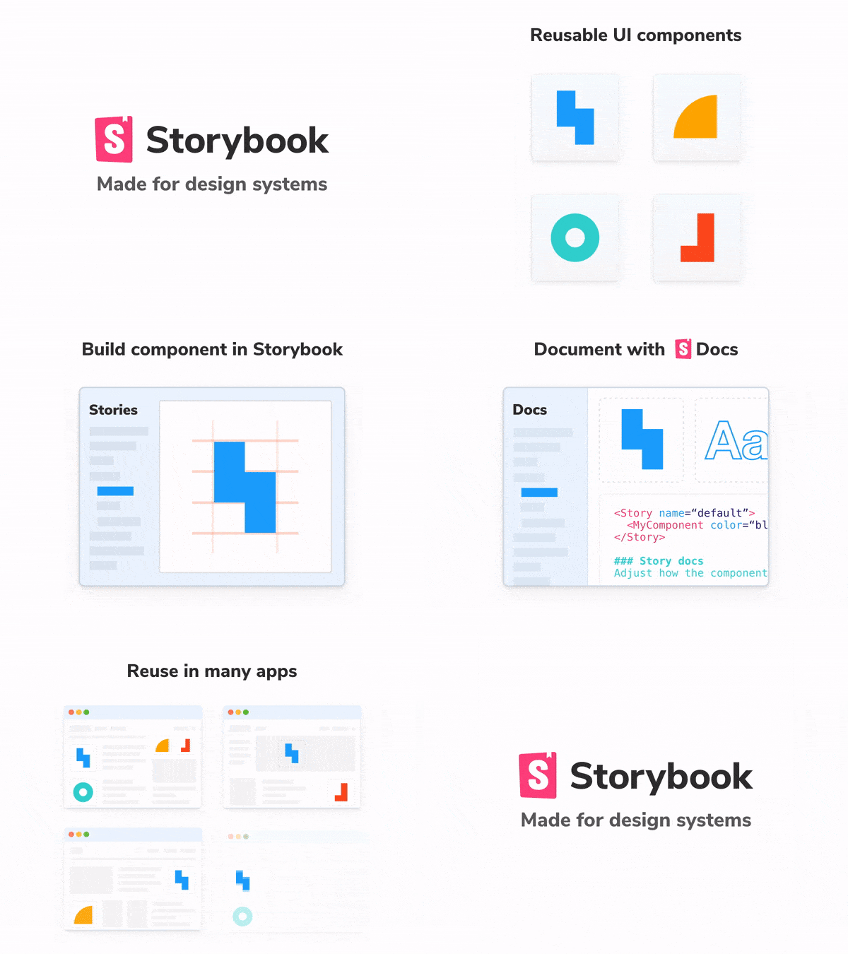
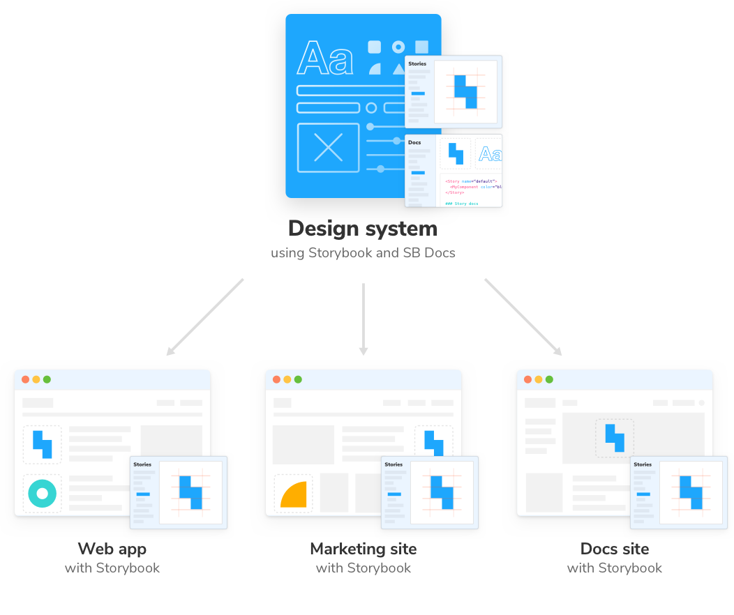
Before we begin, let’s recap why design systems exist. Modern user interfaces are constructed from hundreds of UI components that are endlessly reused to deliver different user flows. Design systems catalog all the reusable UI components to help teams assemble complex, yet durable UIs faster.
Companies are interested in design systems because reuse saves developers time –up to 40–81% compared to building from scratch– and ensure reliable UX across products.
OK, so why Storybook?
In the past, most folks maintained their own stack for component tooling. It was expensive because creating internal tools requires ongoing development effort that would otherwise be used for feature development.
As a free open source project, Storybook is an attractive choice for pragmatic teams. It provides a hot-reloading dev environment, complete with addons for testing, deploy previews, responsive UI, and a whole lot more. In addition, Storybook is maintained by a thriving community which means constant upgrades.
Frontend developers use Storybook for two jobs:
- 🏗 Workshop to build UI components in isolation
- 📑 Styleguide to document UI component usage and props
Using Storybook as a component workshop
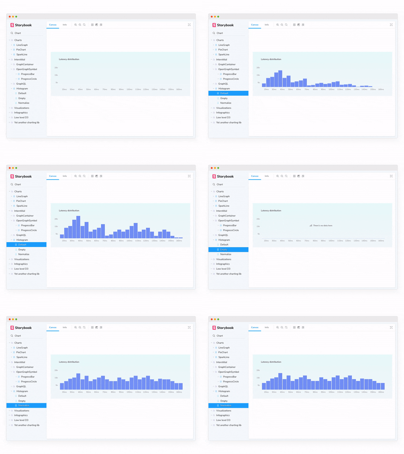
Design systems distribute reusable UI components to many projects but aren’t tied to one app. Developers use Storybook to build and test UI components in isolation from other apps.

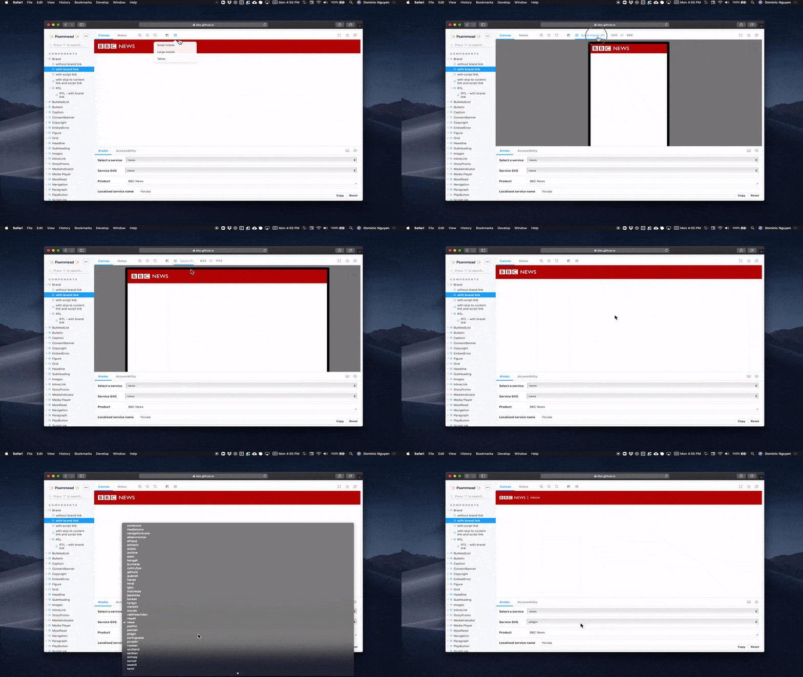
BBC is one of the largest broadcasting services in the world. Their website must support millions of readers across countless devices and browsers. In addition, the UI is localized to dozens of countries from Nepal to Nigeria.
BBC Psammead uses Storybook to build and manage thousands of UI permutations. Recording the UI states with Storybook helps teams understand how components are supposed to behave. They rely on Knobs addon to interactively demo their components. To prevent bugs and increase test coverage, BBC also uses the Chromatic addon to automatically visual test every permutation across multiple browsers.
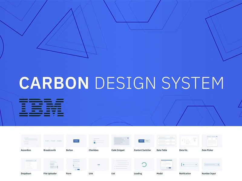
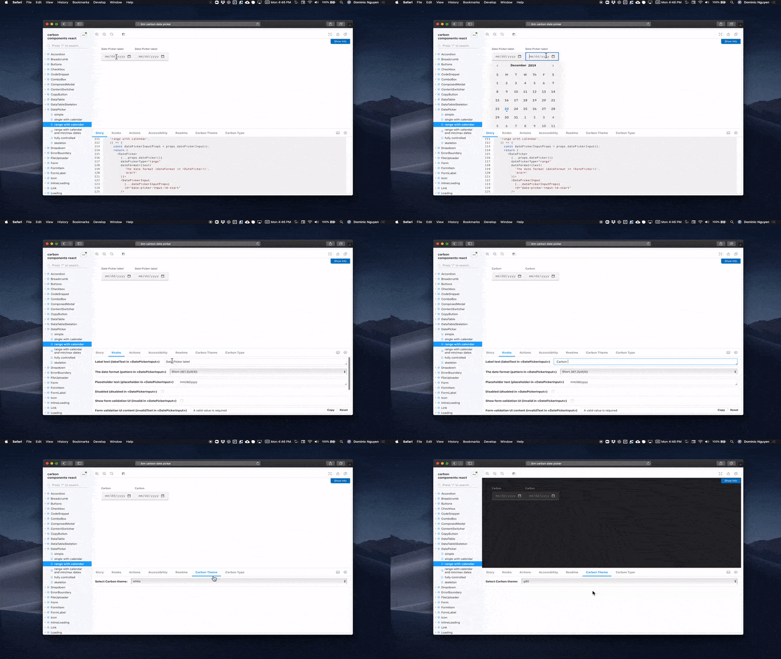
IBM Carbon provides comprehensive visual, UX, and code guidelines for all of IBM which spans 350,000 employees. It services IBM.com, Watson, Security, and cloud services that, in turn, are integral to thousands of enterprises around the world.
Storybook helps IBM create durable components from Buttons to DatePickers for multiple frameworks like React and Vue. Developers can interactively demo component behavior using Knobs, an addon for dynamically editing props. In addition, they’ve created custom addons for IBM-specific theming and typography.
Workday builds finance and HR apps for thousands of enterprises. The Workday platform is architected so that partners from other companies can build custom functionality atop their UI.
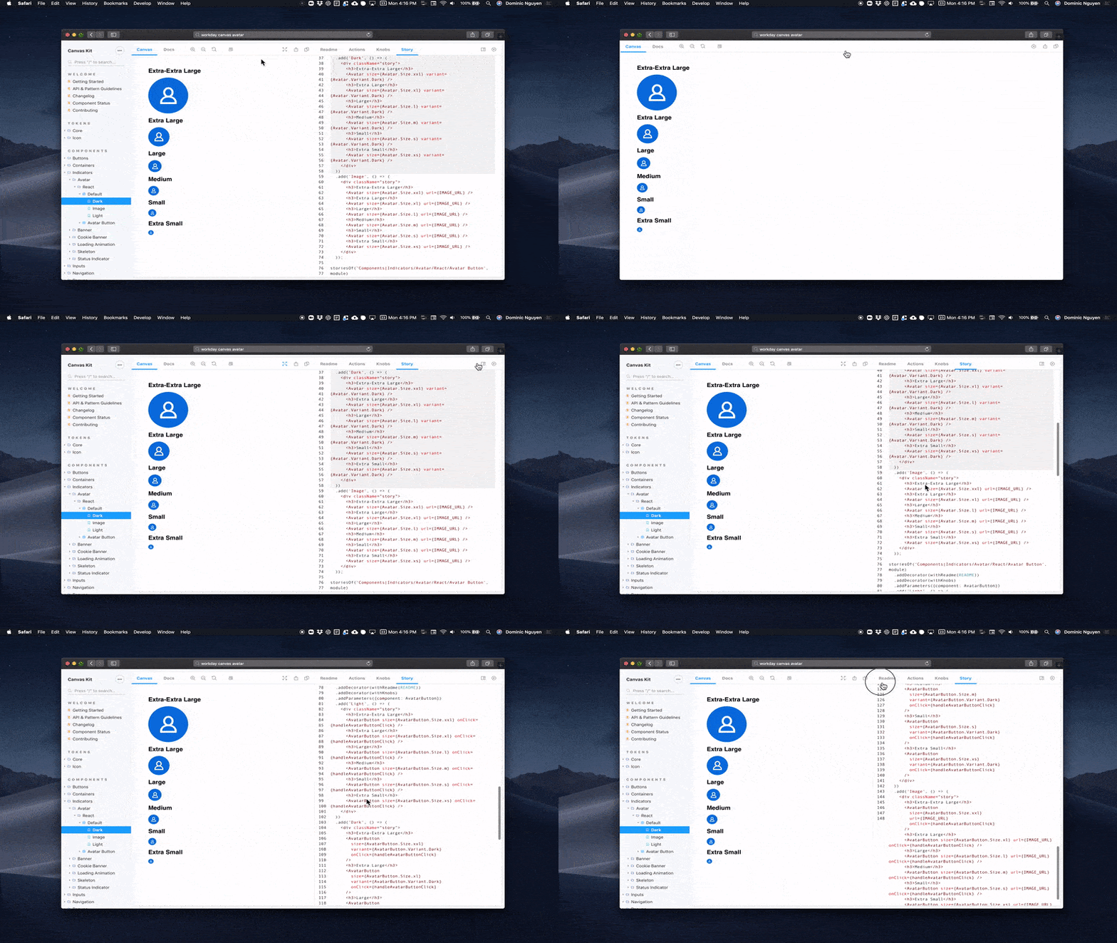
Workday Canvas ships with readymade UI components that in-house product teams and partners can integrate into their apps. Devs reuse components that match Workday’s look and feel to ship features faster. End users get a seamless user experience on the platform thanks to Canvas design system.
The design system uses Storysource, an addon that displays the source code for the story, to allow devs to copy and paste components into their app. Readme addon showcases installation instructions in a tab alongside the component implementation.
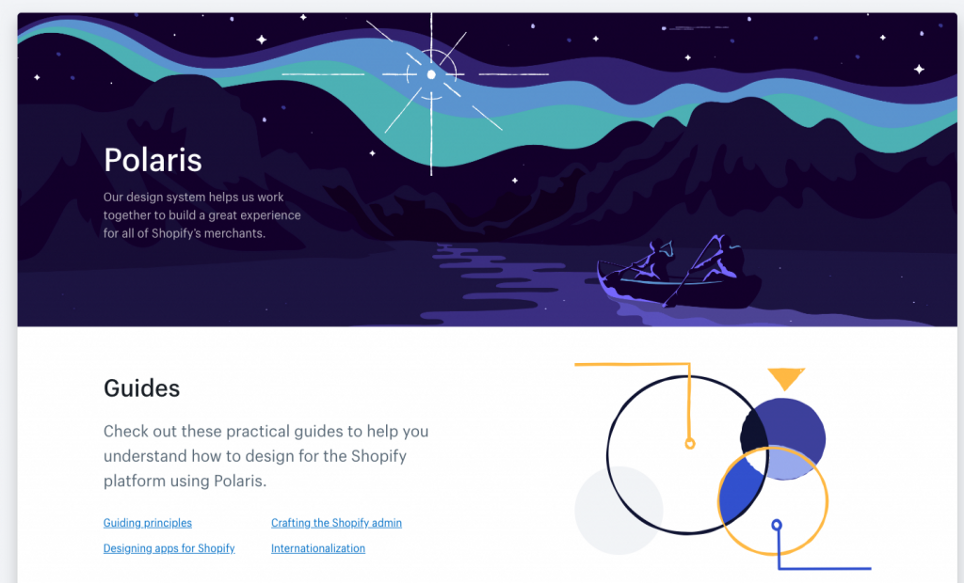
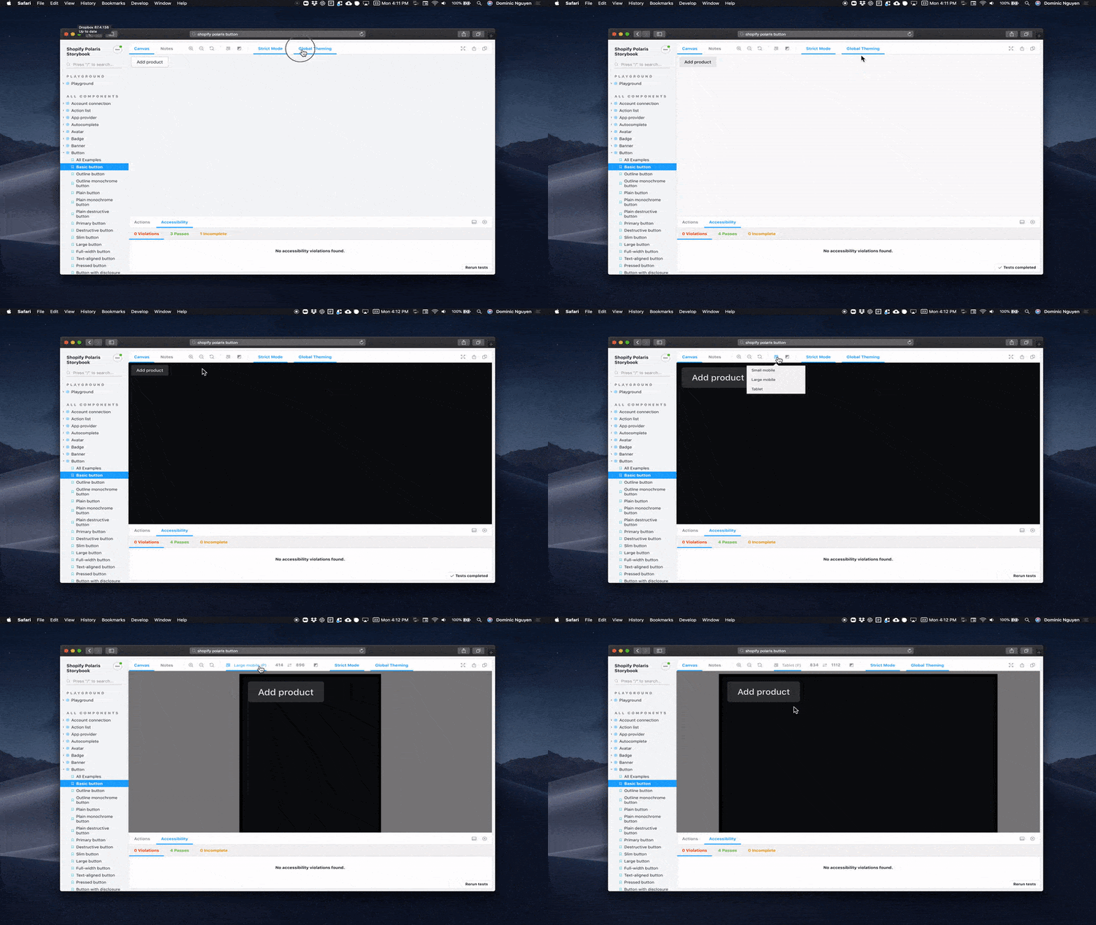
Shopify powers e-commerce operations for over 1 million businesses. Polaris is their open source design system for in-house apps and third-party party plugins.
Shopify Polaris uses the viewports addon to help developers adapt components to different browser sizes. Realtime accessibility auditing is supplied by the accessibility addon. They track component history and gather UI feedback on PRs with Chromatic. Like most teams presented here, they’ve also use the powerful Contexts addon to toggle between Shopify-specific themes.
Using Storybook as a styleguide
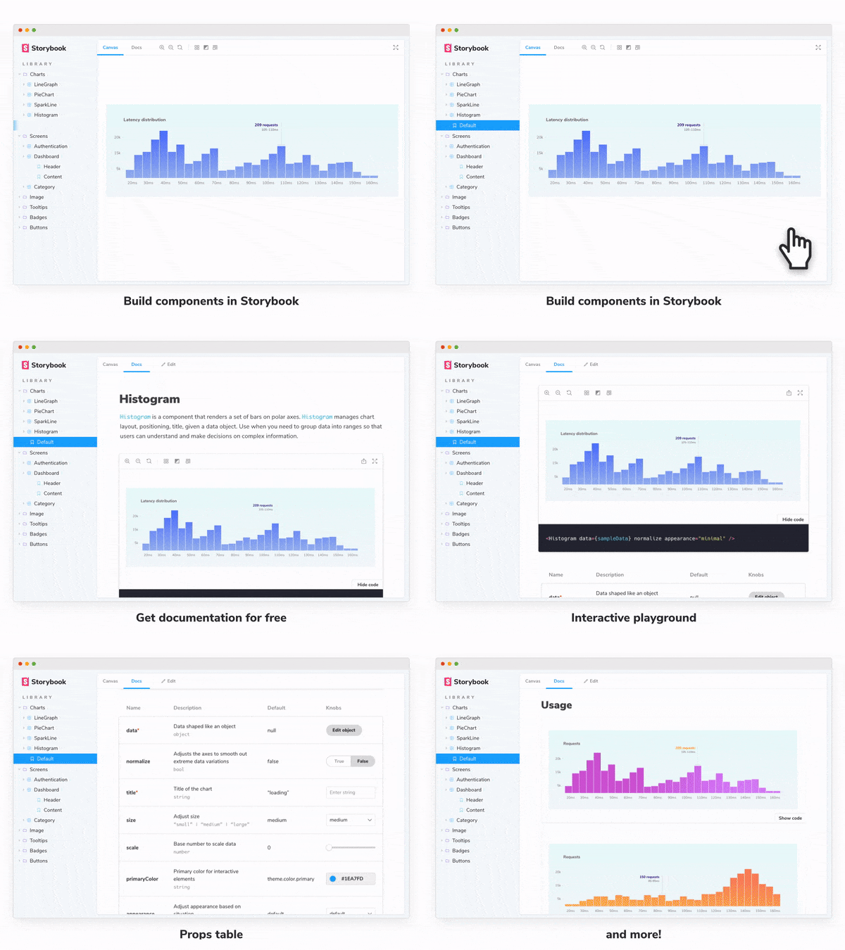
In 2019, Storybook introduced the ability to generate UI documentation from existing stories. Pragmatic developers could build UIs in Storybook like normal and get a styleguide for free.
Storybook Docs generates best practice UI docs automatically. You can further customize the docs with your own theme, MDX, or custom components. This allows teams to focus on writing docs instead of maintaining docs infrastructure. Checkout the stunning examples from the community.

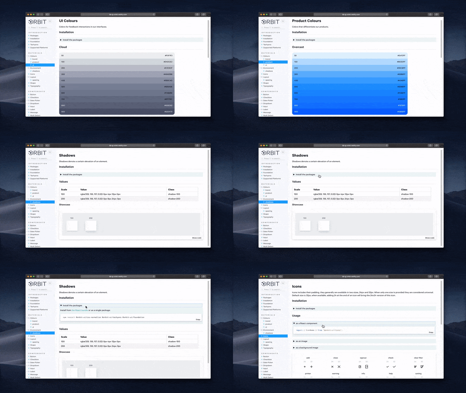
ShareGate by GSoft builds a suite of enterprise tools that helps businesses manage and migrate to Office 365, Azure, and Microsoft Teams.
ShareGate Orbit design system uses Storybook Docs to generate their design system documentation. They use MDX to render JSX components inline with Markdown. Checkout their expandable component that reveals package installation instructions.

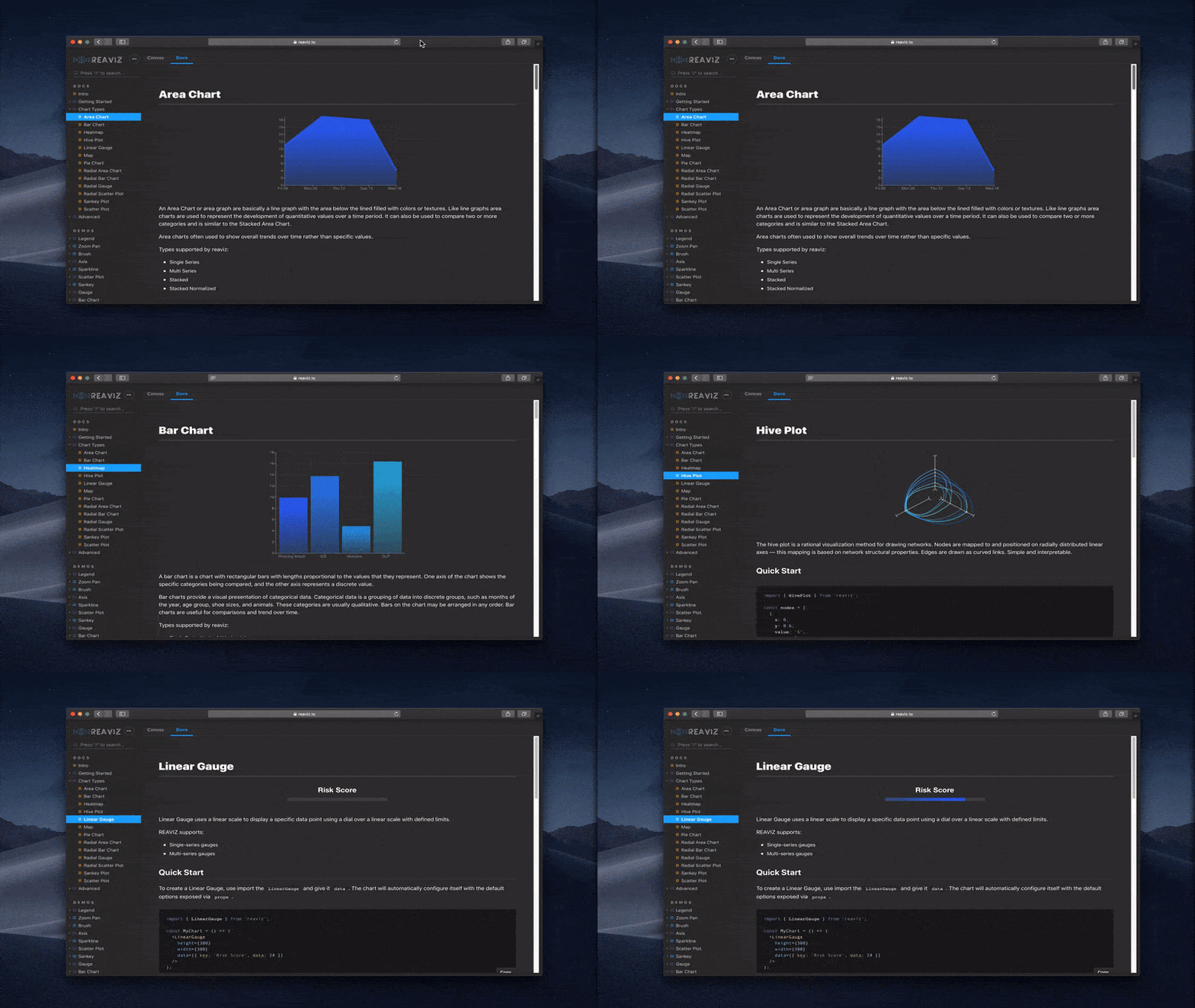
Reaviz, is a modular charting system for React. It uses a custom Storybook dark theme to showcase each data visualization.
Storybook’s tools are integral here for building components and writing usage instructions. Developers can quickly toggle between Storybook’s workshop (Canvas) and UI documentation (Docs) to fully understand how to integrate a Reaviz chart.
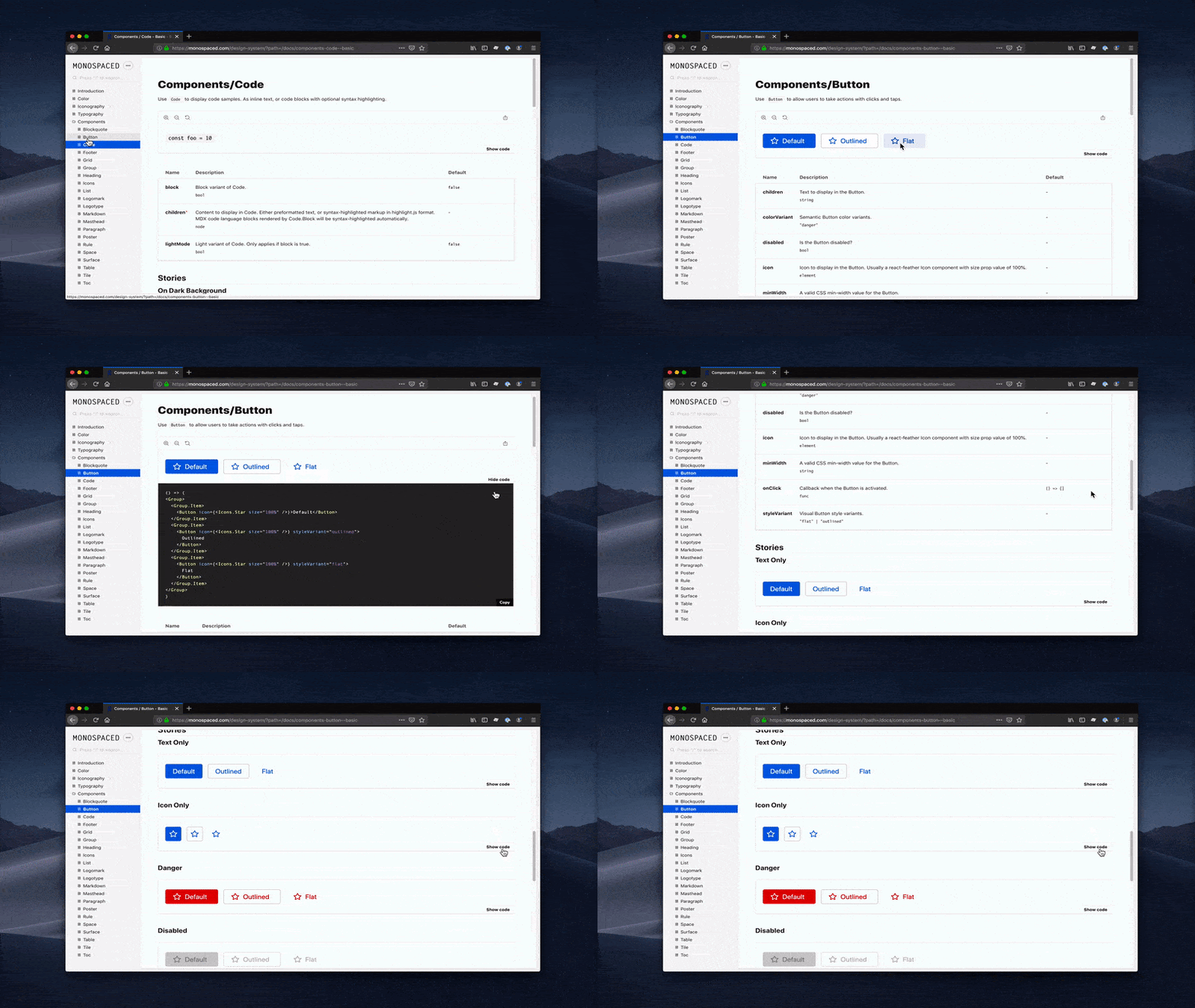
Monospaced design system takes advantage of Storybook Docs to auto-generate UI documentation from components. Docs never go out to date because they’re created from the bonafide production UI component. Whenever you update a story or prop the docs are regenerated.
Onwards
Design systems are exploding in popularity because companies see the work savings of reusable components. This article highlights diverse ways Storybook is used to create reusable UI components and document design systems. I hope it serves as inspiration as you build your own.
Learn how to build a design system
- 📕 Design Systems for Developers: A free 9-chapter guide from Storybook maintainers (me!) that teaches professional developers how to transform component libraries into design systems. Setup the production infrastructure used by leading frontend teams. Peer reviewed by developers at Auth0, New York Times, Shopify, and Squarespace.
- 🎨 Official Storybook Design System: Storybook’s own design system is consumed by three production apps and serves a community of 900+ open source contributors. Browse the repository to get a reference implementation that demos the latest Storybook features.
Get involved
Storybook is maintained by 900+ open source contributors and guided by a steering committee of top maintainers. If you are interested in contributing, check out Storybook on GitHub, create an issue, or submit a pull request. Join us also in the Discord chat. Donate on Open Collective.