Review workflow overhaul
Big improvements to help you review faster
Dev tools should get out of your way until you need them. That’s why Chromatic works seamlessly behind the scenes to save you time via automation and integrations. This release overhauls the user-facing review workflow to make QA much faster.
We value the time you spend using Chromatic. Our goal is to make that time as efficient as possible while still giving you full control.
✨ Build screen clarity
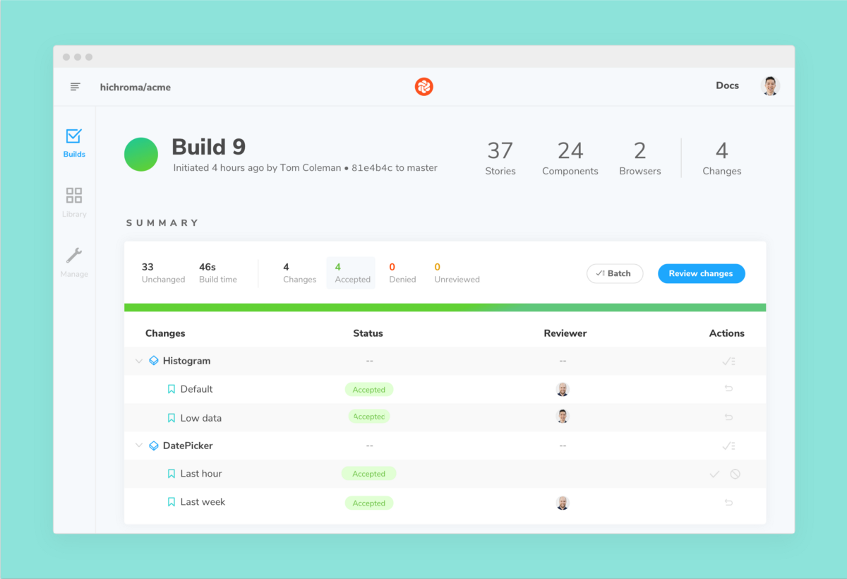
In component libraries small tweaks can snowball into countless changes. The revamped build summary organizes these changes to make it clearer which stories belong to which components.

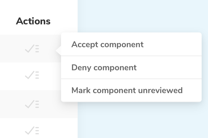
Each row also provides a convenient way to quickly review changes. You can review individually or in batches.
⚡️ Review workflow speed
The snapshot screen was redesigned to make Chromatic’s most common workflow even more efficient.
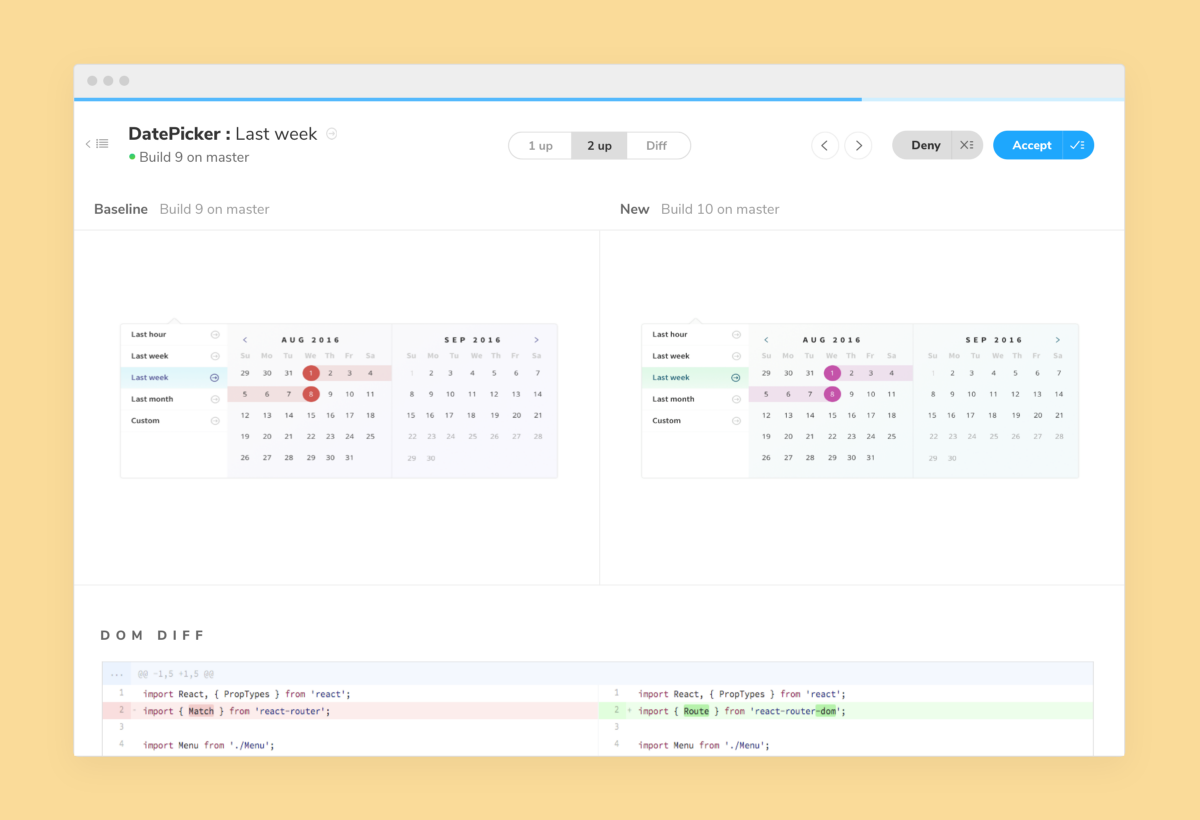
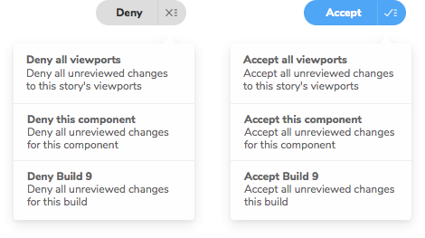
The new combo-buttons allow you to accept or deny all changes from a component or build in one click.
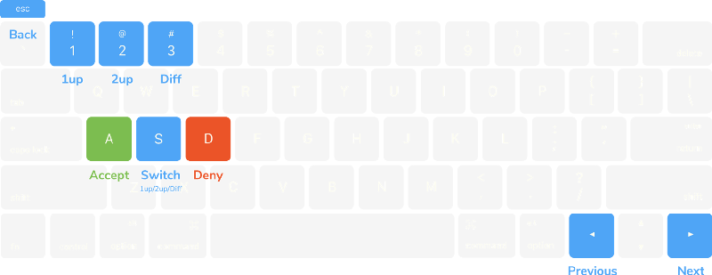
Keyboard shortcuts
It can be frustrating to use the mouse to review lots of changes. With the new keyboard shortcuts you can now review while maintaining your natural hand position.
💎 Component screen focus
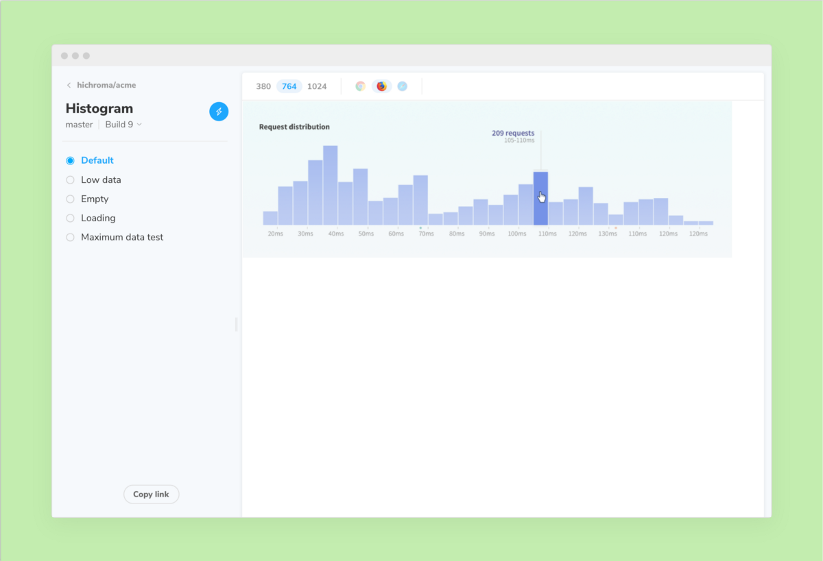
The component screen is simplified to reduce distraction and increase the real estate you have for viewing components. This also lays the groundwork for testing different viewports and browsers.
Chromatic for Storybook — made by Storybook maintainers
Chromatic saves professional developers time and money. Each update we hope to make continuous UI testing in Storybook quicker and easier. Start your free trial now.