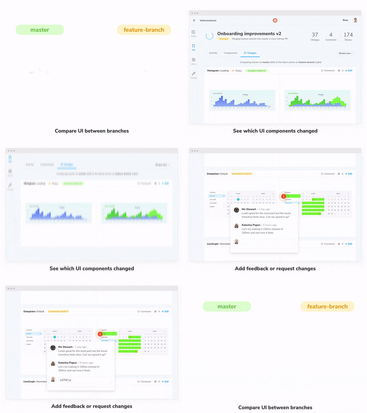
Visual review for pull requests
How to merge PRs faster by automating UI review
“The incompleteness and inconsistencies of our ideas become clear only during implementation.”
— Fred Brooks, The Mythical Man-Month 1975
Over 40 years ago engineers understood that development naturally uncovers edge cases. Today frontend developers discover missing UI states and overlooked technical complexity that can only be solved during development.
Visual Review, coming soon to Chromatic 2.0 (available in Early Access), helps teams verify UI implementation and consolidate feedback in one shared workspace. For the pragmatic developer, you end up building a more durable UI with less communication overhead.
Why?
Code review is essential for gathering feedback from other developers to improve code quality. But what happens when code outputs graphics?
The user interface is a combination of function and form. Code review verifies function but not what people actually see. Visual review is the process of confirming UI appearance. It’s invaluable for refining user interfaces and maintaining UI libraries.
The visual review workflow
This feature is now available to Chromatic 2.0 Early Access users. It’s launching soon for all existing Chromatic customers.
Our mission is to make UI component development faster and more satisfying. With visual review we streamline and automate the feedback process to save you time.
1. Your Storybook is automatically published and versioned in Chromatic’s cloud whenever you push code. Your team will be notified that the component library is ready for visual review with a PR badge.

2. Follow the link to the new pull request screen. If you use GitHub, Bitbucket, or GitLab for code review this screen will probably be familiar to you. But instead of reviewing code, Chromatic’s PR page is purpose built to help teams review UI fast.
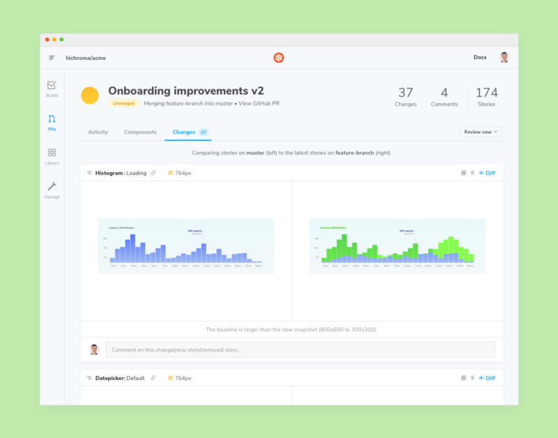
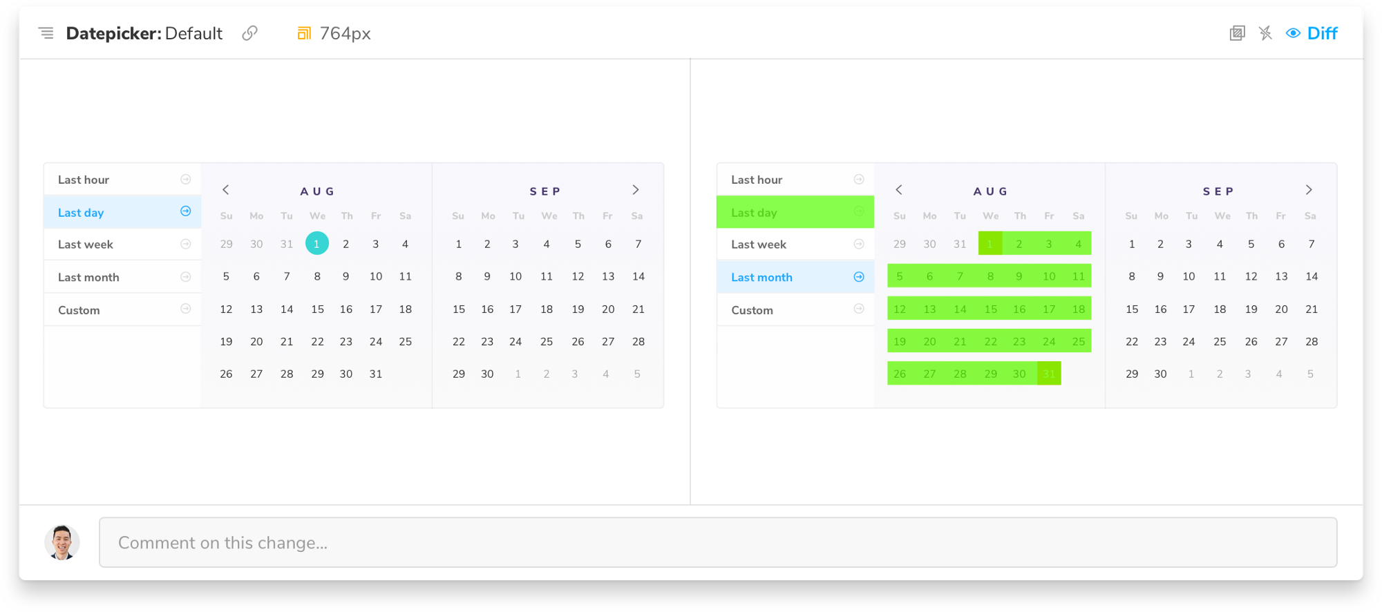
User interfaces are the visual expression of code. In order to review user interfaces you need to see them. Chromatic takes an image snapshot of every story on every commit to keep a visual history of your UI. This allows us to compare UI between branches and surface only what changed.
That means teams can see exactly what changed in a pull request. No more hunting down links to UI variations or pasting screenshots. Share a link to Chromatic with PMs, tech leads, designers and QA to give them a comprehensive overview of incoming UI changes.
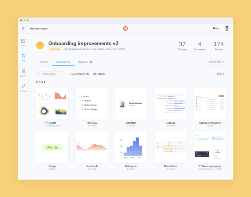
3. Chromatic keeps a branch-specific history of your component library. When you navigate to the components tab you’ll get a searchable catalog of every UI component in the pull request. That helps folks quickly reference components for reproductions and QA.
4. The activity tab is your dashboard for changes, comments, and build history from the pull request. As you scroll you’ll see a feed of UI-related events. This helps you track UI implementation progress in one place.
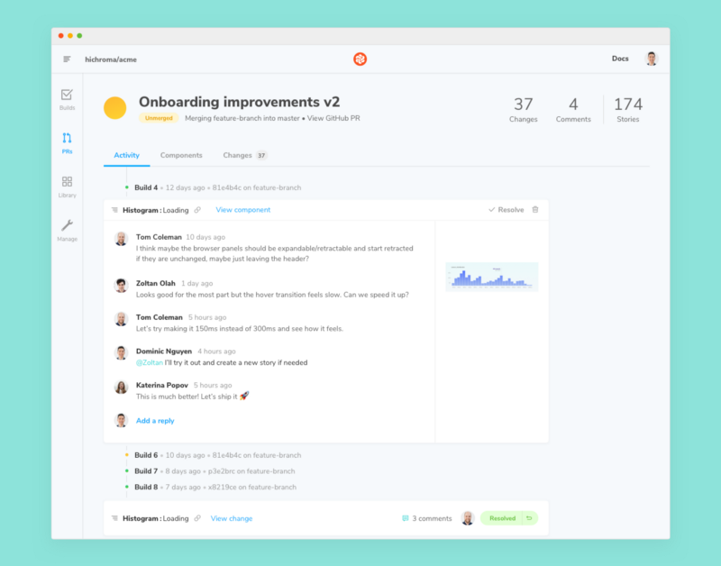
🎉 You’re ready to merge! The visual review workflow helps teams refine UI implementation to ship features faster.
Chromatic’s open source CLI
We open sourced the Chromatic CLI and upgraded storybook-chromatic to 3.0.3. The new package features bug fixes and a smoother setup process. It is backwards compatible with 2.x.
Link to live Storybook
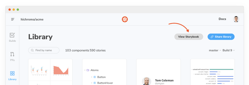
Chromatic uploads and versions your Storybook every commit so you can track the evolution of your component library. We now link to the full Storybook development environment including addons for each commit.

What’s next?
UI development is a team activity but it can be exhausting to balance keeping everyone in sync with actual development work. Most teams get mired in time-consuming chats, issues, emails, and meetings. Our next objective is to stop miscommunication by improving the speed and frequency of UI collaboration.
Join us
- 🌍 Sign up for Chromatic 2.0 Early Access: A secure collaborative workspace for Storybook.
- ✅ Try Chromatic for free: Industrial-grade visual testing for component libraries and design systems. Used by Salesforce, Workday, Adobe, and more.